
Health Profile Card
A wallet-sized card that saved time, hassle, and a life.
MEET JANE
Language barriers and complex medical conditions hindered Jane's ability to effectively communicate her medical concerns to her doctors, and with high-risk consequences; a quick and convenient method was needed to bridge this gap and ensure accurate, timely, and safe healthcare delivery.
Imagine you were just in a car accident, experienced a fall, or started displaying symptoms of a heart attack such as chest pain, shortness of breath, and dizziness. In these critical moments, how confident would you be in accurately and completely responding to the routine questions posed by first responders and medical teams regarding your condition, medical history, and any medications you might be taking or have taken?
This was the challenge my client, whom we'll refer to as Jane for the purposes of this case study, confronted regularly.
Due to her limited English proficiency and complex medical conditions, she regularly faced struggles navigating intricate forms and medical inquiries when she'd become ill or get in an accident. This obstacle to accessing essential and timely medical care was especially pronounced during medical emergencies, where every second is critical, and every piece of information significantly impacts the speed and accuracy of the care provided.
To remedy this issue, I devised a solution that was a true game-changer for both Jane and her physicians. It resulted in not only streamlined communication but also faster treatment, particularly during a recent medical emergency.
[Please note: Client's personal information, including their doctors and emergency contact information, has been omitted to protect their privacy.]
TOOLS
Figma
METHODS
User Research,
Content Architecture, Form Design
KEY GOAL
Address patient and provider communication needs to optimize patient care outcomes.
MY PROCESS
User-centered problem-solving
My approach was rooted in empathy, research, feedback analysis, and usability testing as well as leveraging my healthcare background and product intuition.
I began by gaining a deep understanding of Jane's unique challenges, particularly during symptomatic episodes.
Then, using this insight, I conceptualized and iteratively designed an intuitive design that prioritizes accessibility and ease of use for my client, the patient, and her medical teams in any healthcare consumption scenario.

PRIORITIZING TARGET USERS
Healthcare Professionals & Jane
PRIMARY TARGET USERS: HEALTHCARE PROVIDERS
According to the NIH, between 1998 and 2000 the "average length of 'doctor' visits was 17.4 minutes, the median length of visits was 15.7 minutes, the median talk time by patient was 5.3 minutes, and physician, 5.2 minutes. The median time during which neither part spoke was 55 seconds."
It's 2023 and, honestly, not much has changed. Doctors still spend approximately 15 minutes per appointment, and in that short span, they need to fully assess, diagnose, plan, and prescribe safely and accurately. And the better and more accurately they know you, the more appropriately they can plan and intervene for you.
Because the outcome of this design request should result in providing Jane with the best clinical outcomes, I would first need to satisfy her health team's interaction needs. Therefore, I decided that healthcare providers would be my primary target users.
SECONDARY USER: MY CLIENT
Jane is my secondary target user because after her care provider needs are met, she can then continue to use the card to help clarify or fill in any further essential information needed using the card as a medium.

Primary Target User: Healthcare Professionals
Healthcare providers are my primary target users and my client is the secondary target user because the goal is to provide my client with the best clinical outcome possible through my design solution.
Doctors spend on average about 15 minutes per appointment and sometimes have even less time given the clinical scenario.
◦ How can we optimize the use of doctor's time to give my client the best clinical outcome possible with every medical interaction?
CLOSER LOOK
The Obstacle Course of the Clinical Diagnostic Process
Jane's biggest hurdle to accessing prompt medical attention occurred during the various diagnostic inquiries of the information-gathering phase of the diagnostic process.
As you can see below though in "The Diagnostic Process" diagram, the diagnostic process is quite linear. To get to clinical health outcomes, the process starts with a patient having a health problem, engaging with the health care system (seeking help), then going through diagnostic inquiries and an information gathering phase, followed by communication of their diagnosis and getting treatment.

Jane's problem area in physicians' diagnostic process:
Clinical History and Interview of the Information Gathering Phase
I researched the clinical diagnostic process more in-depth to better understand clinicians' medical inquiries then ideated to relieve Jane and her medical teams of this portion of her medical interactions.
My hypothesis was that by mediating this phase of the process I'd be alleviating the information-gathering portion from Jane and her doctors. Jane's medical teams could then make better efficient use of their time concentrating on evaluating and treating her current clinical problem rather than dedicating time and effort to uncovering relatively unchanging past medical histories and information. This would in turn also relieve Jane of much of the daunting and stressful question-answering responsibilities that were giving her the most anxiety during healthcare interactions.
"An appointment begins with an interview of the patient, when a clinician compiles a patient's medical history or verifies that the details of the patient's history already contained in the patient's medical record are accurate.
A patient's clinical history includes..."
-
documentation of the current concern
-
past medical history
-
family history
-
social history
-
current medications (prescription and over-the-counter)
-
dietary supplements
-
other relevant information
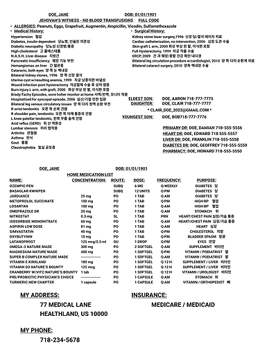
THE FINAL DESIGN
Meet the Health Profile Card
My design solution to Jane's problem was a Health Profile Card, an informative patient profile card that eliminates the need for healthcare professionals to ask preliminary past health history assessment questions on information that is rather unchanging such as one's name, date of birth, address, medical and surgical history, etc - a form of "hand-off" of significant clinical information that influences patient care outcomes.
This present final design is a final culmination of empathy, research, data, and iterative effort that has proven to now read intuitively and serve any medical professional in any given medical scenario, emergent and non-emergent to help Jane.


Back
Front
OUTCOMES AND LESSONS LEARNED
If everything's important, nothing's important.
While the card was a success at relieving Jane of answering all the questions from the information-gathering phase and even managed to get her talking to doctors about her problems faster, the first iterations of the card were still "rough around the edges", literally and figuratively. Though helpful to Jane, for physicians and healthcare professionals, the first iterations looked, read, and even felt like more of an "information dump" than an informative card.
Usability testing confirmed this. Initial reactions to the first iterations of the card were that healthcare professionals thought it was "very helpful" and that they "wished more patients would carry something like this". But they also stated: "The information was kind of hard to read". (see sample of first mockup below)

Typography, alignment, and architecturing - they were all causing the content to "scream over each other" making the card fall short of the intuitive experience I was originally going for. My first designs were too much of a reflection of my own subjective eye thinking all the information about Jane on this card was important and relevant in every moment. While true, it needed to be more visually representative of the rhetoric and thought sequence of my target users, the clinicians. So, I iterated further.
I looked back at the diagnostic process, reminded myself of clinical hand-off communication techniques, and also looked at other sources of design inspirations that portray a lot of information such as dashboards, health forms, EHR's, newspapers, and even email inboxes. 😆
With every successive iteration, especially after applying a design style guide, content architecture, and visual design techniques like zebra-striping, the card was enhanced becoming more and more intuitive and readable. Most pivotal in my design iterations was my implementation of a design style guide and adherence to it as a "single source of truth". It significantly contributed to improving information hierarchy and improved the overall consistency, readability, and discoverability of the card.
This project was a great reminder that "if everything's important, nothing's important." It was also a great reminder of the importance of not just sweating the details in getting to know the users, their feelings, needs, and journeys, but also taking it a step further and sweating the details and continuing to double-check if I'm keeping it user-centric end-to-end into every detail of the visual design phase as well.

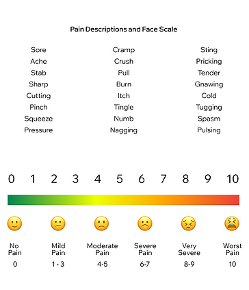
LOOKING FORWARD
Assessment Tools: Pain scale, Body maps, and more.
The current version of Jane's Health Profile Card has proven highly effective in conveying her essential health information intuitively to any healthcare professional in any clinical scenario. Notably, it has saved doctors and nurses time, allowing them to concentrate more of their energy on physically assessing, educating, and treating Jane's conditions over figuring out her past medical history. During a recent medical emergency, Jane's preparedness, facilitated by the card, left a positive impression on emergency personnel. Some nurses even took photos of her card, inspired to create ones for themselves and their loved ones.
Looking ahead, the focus for future iterations will be on further improving patient-physician communication, especially during emergency situations, with the goal of equipping Jane and her medical team with handy physical assessment tools. This includes exploring tools like pain scales or body maps to streamline and improve patient-physician interactions. Here's a sample of what I imagine it to look like as a first draft.


DISCOVERMORE OF MY WORKS
Case Studies